
This article is about pebble dash, the Barbican, the Queen, ugly projections and working class graphic design.
Bad design – it’s everywhere it seems. The ugliness of our world stalks us like a malevolent clown, laughing at our grey displeasure as we rush from here to there, stressed by how effectively we manage to project the lack of beauty in our selfs into our urban surroundings.
But, does bad design actually exist or is it just an internal experience? After all, one man’s beauty is another man’s ugly. And what does the term ‘bad design’ actually mean? Ugly? Not fit for function? In fact, is ‘bad design’ the actual opposite of ‘good design’? If beauty is in the eye of the beholder, then so is ugly is it not?
So, the main question here is : Is Good Design design that is fit for its beholder? Or, put another way, is Bad Design design that which is not fit for its target market?
Is Good Design just a matter of social class, upbringing, and education?
Pebble dash – don’t you love it. Well, some do, some f**king hate it. A pebble dashed home to some can alter their mood instantly as they walk past it – so much so that some would rather walk a longer route to work in order not to walk past such a ‘monstrosity’. Others use their life savings to get it done, covering up ‘common’ brick work and giving their house more of a ‘castle’ feel.

In fact, pre WWII pebble dash was a design feature used on middle class houses but got a bad rep after being used extensively on council estates post WWII to cover up bad brick work. Today pebble dash actually diminishes the value of a home. So is it possible to say that pebble dash is actually bad design? Most people would say yes.
But how come – if it was a good design choice before the war can it now be a bad design choice (from beauty to ugly) – what happened in-between? What happened was that it was used on council estates and its initial design ‘beauty’ was tarnished by social class and went out of fashion with the middle classes. Therefore, can a something be good design to one social class, and bad design to another at the same time? It seems so, which very much complicates the issue.
So when function is equal (i.e. brick and pebble dash render are fit for function) social class can be the determining criteria to whether something is good or bad design. In fact , in the US maybe they missed the post war uses of pebble dash and still see it as a unique design feature – so much so that these builders take their name from it – Pebble Dash Builders – and are very proud of it.
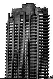
 The Barbican in London – an ugly tower block or a grade II listed building? It has been consistently voted ugliest building in Britain but also lionized as a beautiful example of modern architecture. The Queen said it was one of the wonders of the modern world. Which is it?
Walking down its long tunnels on a wet Monday afternoon on the way to a particularly uninspiring unloved job it can be said that the Barbican does not help lift a mood that’s for sure. It is ugly in its grey damp concrete walls and lack of even a distant nod to nature’s forms or elements. The many walk ways with intermittent dirty puddles are reminiscent of all the badly designed needle strewn urban spaces beneath the tower blocks of the 80s. But doing the same walk on the way to the cinema having bunked off work and made a decision to leave said awful job and go traveling around the world it can be the most beautiful magical place ever – its strength and unabashed brutal beauty mirroring the strength and confidence to go it alone in life one aims for.
Therefore, is good/bad design just a projection of our internal mood/hopes/wishes/wins & loses and therefore not so much in the eye of the beholder but more in the mood of the beholder? Or is there such a thing as an education in Good Design, meaning good design is something constant and objective which needs to be learned to be recognized and appreciated? But is ‘design’ that needs a degree to be understood ‘good’? Does the beautiful through its simplicity not communicate its beauty without pre-requisites?
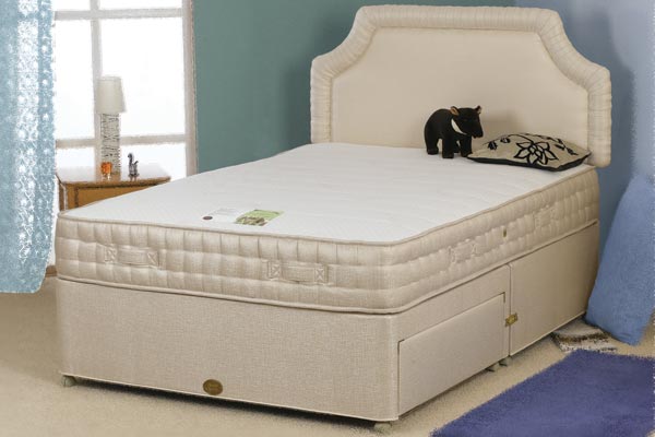
This brings us back to Bad Design and target markets. If a middle class logo designer designs a logo for a cheap bed company whose customers are mainly working class – should he design a ‘working class logo’ for the company i.e. should he fit the logo to the market? Is there such a thing as a ‘working class logo’? Is there such a thing as ‘working class graphic design’? Or do logos become ‘working class’ through usage and not by design?


Is the nike swoosh a working class mark? Is Stella a working class brand? Is Stone Island the first accidental hooligan clothes brand?

Take the bed superstore Dreams. Was the logo designed by working class logo designers to fit their own tastes – or was it designed by a middle class agency with the intention of communicating the brand values effectively to the target market i.e. low quality low priced goods?
Obviously, social class distinctions are very non-specific in today’s Britain, but they still determine a lot of buying behaviour, whether it be aspirational, inspirational or class warfare.
What have we concluded? That Bad Design can be very susceptible to social class. And that the experience of design can be in the mood of the beholder. And that Good Design is sometimes very target market specific.
Next post….more bad design, not as determined by social class fashions, but by being lazy and rehashing old cliches to make a quick buck. And there’s a lot of that about. Amen.
