
There are some websites out there which, even though they do the job well enough, and haven’t knocked down pedestrians when drunk driving a car, are just so damn ugly they might as well have. More than this, the companies below are top 100 brands in the world. You would think they could buy some one in with a bit of taste, with some knowledge of space, of typography, some one with a bit of feeling for this kind of thing. It’s funny, because companies at this level spend massive amounts of money on making sure their products elicit the correct feeling in their consumers, but when it comes to their website that aim disappears. It seems the main aim of some of these websites is to get as much info in as small a space as possible. They seem to lack direction and a target. The website becomes a box to throw things in with no thought for the person who needs to find something in the box.
‘You want to see all the red lipsticks we have for sale you say? Well, just stick you hand in that there box and I’m sure you’ll find them soon enough. Go on, it’s fun. Browse with your hands. For a couple of hours. We all love looking for things we can’t find!’
L’Oreal
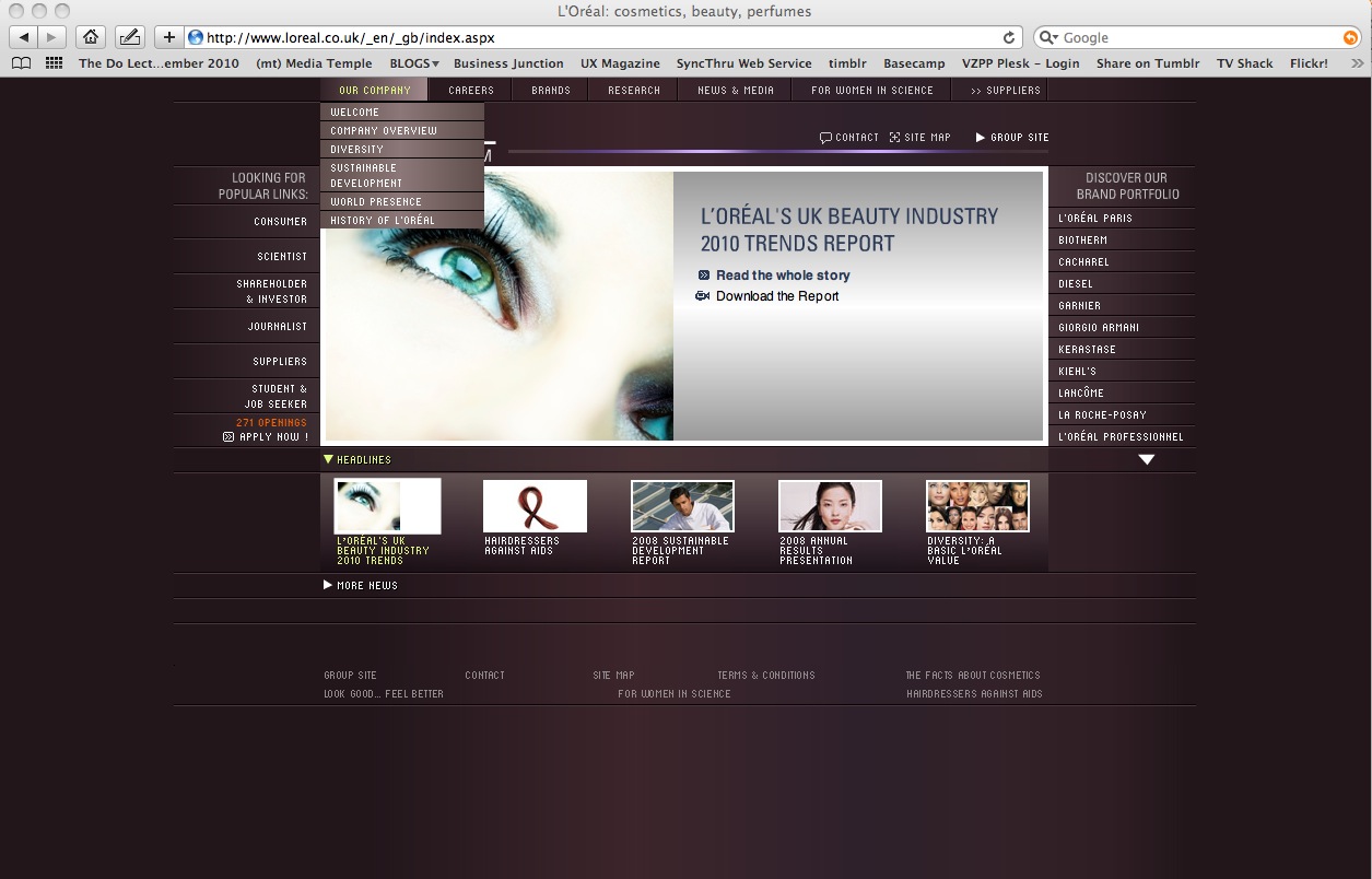
L’Oreal are number 44 in the world’s top 100 brands for 2009 and worth $7748 million (according to Interbrand). Their website looks like they spent £5000 on it at their local ‘Jark Website Solutions Company’ run by Mark and John, two computer science graduates who love drop down menus and 800 x 600 resolution websites and who spend hours telling their clients about their ISO 9001 accreditation.
It is absolutely amazing to me that this website sits on both their .co.uk and .com URLs. This is what they want their customers to ‘experience’ of their brand – a circa 1995 corporate website – which now could double quite well as Ben10s interactive site for 9 year old kids. Have they purposely dumped everything in one page? Brands, corporate info, trends reporting, jobs..all sit nicely around a central image like children on a camping trip with wee in their pants. They have squeezed 4 websites in to one space as becomes apparent when you click on one of the links:

E Voila! A completely new website inside the old one with yet another navigation bar! I’m trying to work out what the overall brand message is at this point – I’m thinking it is something like ‘we make creams that are everything to all people, packed with every ingredient we could lay our hands on, and can be used on your nose or your arse as they are so versatile. Makes no difference what so ever to your arse or your nose, or us’.
J.P.Morgan
Number 37 on the top 100 brands list worth $9550 million, and and all they could afford was this brown website with lots of boxes ramdomly placed on it with JP’s actual real autograph carefully positioned underneath! Oh, what design! Oh, my heart bursts with the joy of love and beauty of the potential of human creativity and experience!
I sit looking at this site and wonder what it wants from me – and all that comes to mind is Scarlet Pimpernel and card board flat pack moving boxes. Go figure.

Number 3 in the 100 top brands list for 2009 and worth $56647 million. The website is just so uninspiring, so damn ugly that it had to be included. This site explains everything to me about why Windows has to be updated every few years in order to make it a bit more palatable to the millions of suffering users out there. Maybe by Windows 10 ( wow…what a party that will be!) it will actually let you get on with doing some work instead of trying to work out how to stop those pop ups in the bottom right hand corner putting your eye out.
Why is this site ugly? It is just so off balance – the text at the bottom is so small you actually feel sick trying to read it, the nav bar feels like it doesn’t want to be there and the fumbling combination of image boxes in the centre in some meagre attempt at creating ‘feeling’ is laughable.
And what does this site want from me? Instead of feeling included and creative I feel excluded by the small text, the use of jargon and general techy feel. Microsoft is a company run by train spotter’s.


