
This is a particularly bad blunder because the lack of continuity of brand experience between offline and online sets up a customer for a big disappointment – with the accompanying loss of brand credibility. It could be because of laziness that this happens, or the lack of communication between the offline and online parts of a company. Or it could be due to a lack of understanding of how customers build up an impression of brand from multiple touch points – billboards, tv ads, web banners, magazines, high street shops, website etc. If they experience brand inconsistency across these different touch points they will feel confused and will be unable to identify with the brand in a cohesive manner. This will mean the brand message will dissipate and be lost.
Amex
 American Express currently have an colourful illustrated campaign all around London. It is something of a rebrand for a credit card that has often portrayed itself as aloof and status orientated. The new adverts are illustrated in a friendly and open manner detailing how the Amex card can be used to buy very small things. All very nice.

Space NK
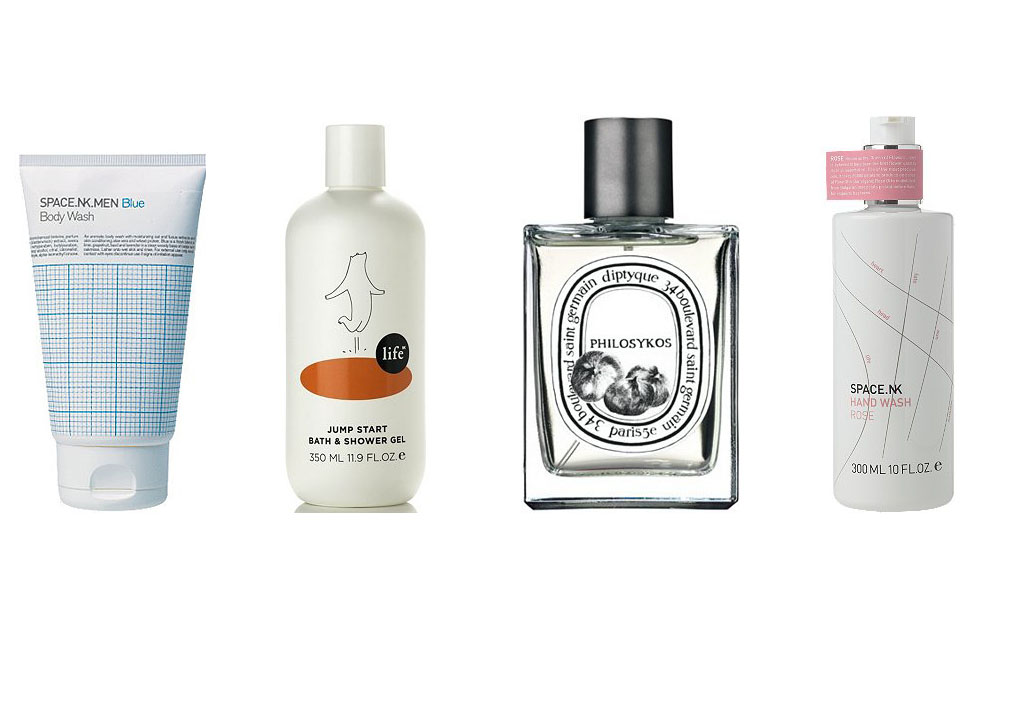
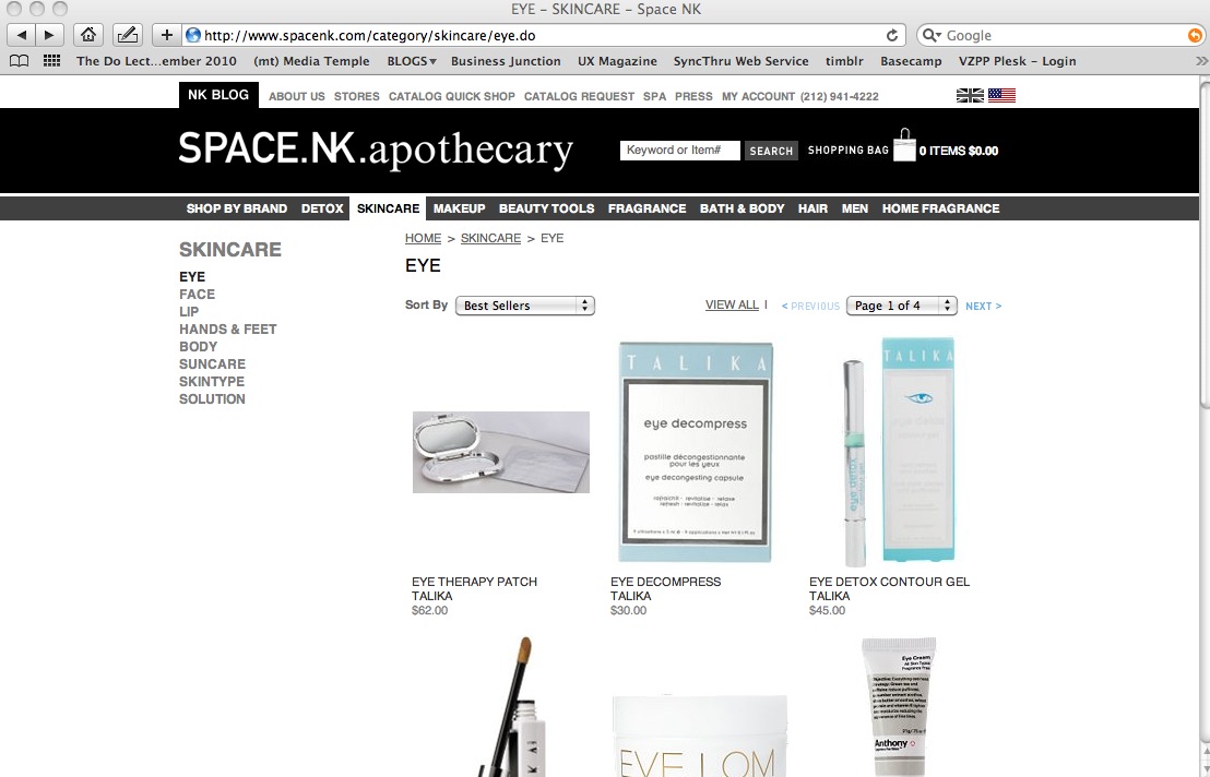
Space NK is international chain of shops selling beauty products. The aim to ‘source and offer a carefully edited selection of high quality, original and effective beauty products from innovators and specialists around the world’. Their shop interiors are meticulously planned and their product packaging is designed for each market with intent and it seems, passion.


IKEA
IKEA are known around the world for their cheap designer products for the home and for their attention to service. IKEA boast about putting the client at the centre of everything they do. The are constantly redesigning products in order to bring them to market at the lowest price possible. In some ways IKEA have democratised design and allowed ordinary people to interact with design in their everyday lives. In their shops they are constantly innovating new ways to increase the customer experience of ‘IKEAness’. They put a lot of effort into this, and have been rewarded by the customer loyalty and profit. It is strange then that their website is such a fiasco.


Oh….the product is not sold online!
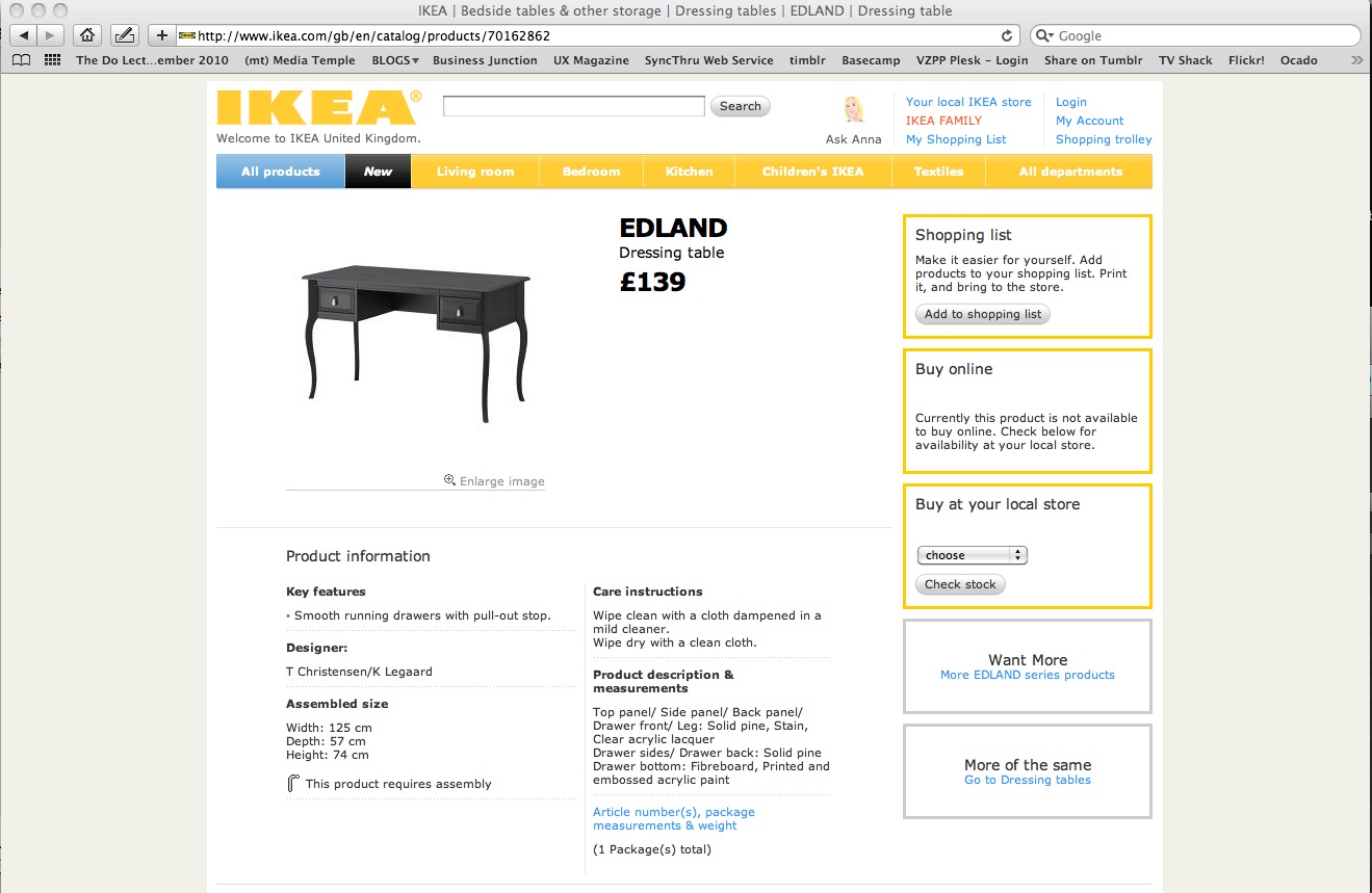
But I can add it to my ‘shopping list’! Gee, thanks…that makes up for my disappointment. In fact, most of the IKEA products on the website are not available, and in some instances only one part of a product is available online and the other part is not (Kora kids bed & canopy for example). Want a lamp? Yeah. Look nice don’t they? Yeah. Well you can’t buy any. Just looky looky, no touchy touchy..unless you drive out to one of our easily accessible shops near a motorway which you need a car to reach! Very environmental.

The point here is the discrepancy in the levels of service between the shops and the website. In the shops everything is for sale, everything is at arms length. You help yourself. IKEA shops are a very immediate experience – you see something in situ ( in a living room mock up) – you touch it, you sit on it, you put it in your trolley. Done. On the website they have replicated that experience with the clickable images, the good photography, the nice clear design, the continuity of branding. Except you can’t actually buy anything! It is such a disappointing shopping experience, and so detrimental to their brand that I would suggest they either turn the website back into a brochure site until such time as all the products are available or put a big warning sign on the home page saying
And this could be said of a great many commercial online experiences.
