
So, you have a multimillion pound brand, created over years of creative hard work and advertising expenditure specifically designed to communicate effectively with your target market and to give them the user experience you have tailored. Everything is under control. And then you go on to the web and mess it all up. Doh!
The website is now the first touch point (the first quantitative experience a customer has of a brand). Therefore you would think companies with so much invested in their brand communications would invest some money and effort into their websites right? Don’t seem to be the case. Even the biggest brands in the world still have websites that were designed based on the original BCN (banner-content-navigation) design model used since around 1996. Some of the design templates used to communicate the qualities and relevance of these multimillion pound brands are nearly 15 years old. I can imagine the conversation between the Marketing manager (who most probably has a PC running Windows 98 and IE 6 because the IT department doesn’t see any need to upgrade – if it works why fix it?) and the internal Website guy (cue rubbish generic picture of two people meeting) :

Marketing Manager: ‘So, we should redo our website?”
Web Guy : ‘Yes. I have the template here. All I need is the banner with current advertising image, a short paragraph of copy detailing what we do and the logo and…that’s it. Oh, and what colours do you want to use?’
Markting Manager: ‘Blue? With a touch of yellow? They always go good together don’t they.’
Web Guy : ‘Yep. Sounds good.’
End of design meeting. When I say ‘design meeting’ – I actually mean ‘colouring in meeting’. What this meeting doesn’t include is the customer (as well as some one with a brain obviously).
A website is now the experience of the brand before the High Street shop is. Therefore it must in some way remodel and repeat the brand experience online as it is offline if the brand isn’t to become generic and lose market share to lesser brands with equal websites. And this does not mean using flash and running videos on the home page. It does mean meeting the customer’s brand expectations (brand expectations built up offline) immediately from the home page down to the contact details page. This is also true the other way round – if a brand has been created online and moves offline (for example – how would Amazon keep their brand intact if they appear on the High Street?).
A website is now the experience of the brand before the High Street shop is. Therefore it must in some way remodel and repeat the brand experience online as it is offline if the brand isn’t to become generic and lose market share to lesser brands with equal websites. And this does not mean using flash and running videos on the home page. It does mean meeting the customer’s brand expectations (brand expectations built up offline) immediately from the home page down to the contact details page. This is also true the other way round – if a brand has been created online and moves offline (for example – how would Amazon keep their brand intact if they appear on the High Street?).
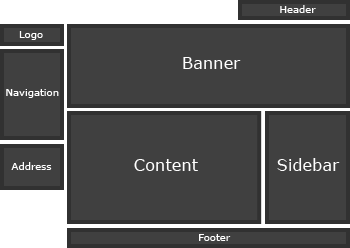
The original web design templates are based on a magazine brochure, generally because initial websites due to low connection speeds were very non-visual, and because no one knew how to restructure a company offer in more visual terms. The model allows for a front image/banner (magazine cover) along the top, an introductory bit of text (prologue), a nav bar (index), a footer (publication info) and the rest stuck in a long selection of pages (some up to 4 clicks away). Or a variant of this was just do away with the text and dump all the links in the middle as if to say ‘He we are. Find your way as best you can!’

A real world commercial example of a BCN web design would be the equivalent of walking into a shoe shop where a man standing in an empty room with no shoes in it explains what the company does – ‘We make shoes of very good quality and we have been doing this for…….’ Once the prospective client has listened to this intro he is shown a list of the type of shoes they have from which (without seeing any of the shoes) he must pick one. He is then taken through a door where the chosen shoes are laid out. If he wants to see another type of shoe he must leave the room, go back to the list and pick another type and then go through another door. This type of shopping experience is enough to make you want to walk around bare footed in the snow, but many companies out there still do just this.

The failure of design to initially understand the web has some parallel in the evolution of electronic music (from electronic instruments used only to mimick ‘real’ instruments to then becoming instruments in their own right) and is a consequence of trying to adapt current design patterns to new technologies (a great current example of this is the horrible ‘turning the page’ technology online magazines are trying out).
A website is a visual entity. Reading on the net is laborious and because of backlit screens straining on the eyes. Therefore any website that wants to tell its customers what it does instead of showing them has not understood the platform. As in films, novels and any other experience generating art form (into which I would place branding) the most basic rule of all is:
Show, don’t tell.
The 5 basic rules of commercial web design could be :
1. Show your customer what you are, don’t tell them
2. Show your customer what you sell, don’t tell them.
3. Show your customer what you want them to do, don’t tell them
4. Show your customer what you believe in (through the quality of the website), don’t tell them.
5. Show your customer what your brand stands for (through the user experience), don’t tell them

Next blogs will deal with the Bad, the Ugly, the Lazy, the Good and the Great in Commercial Web Design. First up – The Bad.

I really like your blog. Especially when you mention web design which is also my chosen career. It is amazing how many businesses out there try to take shortcuts when putting a website online. How can someone pay a mechanic but get free websites from their childrens’ friends?