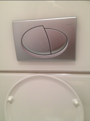
When I look at this design for the two flush option I am unsure of which to push.
Is the large ‘button’ larger because it is the most used flush type or because it indicates the large quantity of water to be used? That is, is the small button for big jobs and the large button for small jobs? Intuitively I would think the opposite but UX design wise I would wonder if ease of use trumps symbolism?
It’s a mystery, it’s all a mystery!

